visualbear
Brand & Portfolio
Duration
August - November 2015
Responsibilities
Brand, UI & Front-end Design
Tools
Paper & Pen, Illustrator, Photoshop, Handlebars, Sass
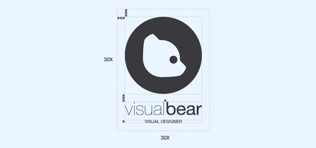
The design of my personal brand and portfolio identity. In 2012, I set out to carve out an identity for my portfolio, and my signature. Focusing on the central aspect of "björn" (bear in Swedish, and also my last name), the emphasis on the word "bear" and the logo tie it all together.
Challenge
Although differet areas, the brand identity and web site were both very closely related, and built with eachother in mind. Colours, proportions, and visual patterns were shared between the two to certify the brand worked well online, and the website exhuded the brand language.
Goals
-
- The goal was to define an identity, both for my brand but also for my web presence. As an excercise in designing a brand and a website, this project was important in more ways than one.
Core
Core elements are the most basic components used to build the site. Colours, type and basic buttons are defined here.
Colours
Light Grey Blue
Blue
Orange
Tomato
Medium Grey
Dark Grey
Fonts
-
Primary font: "Nunito", sans-serif;
-
A B C D E F G H I J K
L M N O P Q R S T U
V W X Y Z
a b c d e f g h i j k
l m n o p q r s t u
v w x y z
0 1 2 3 4 5 6 7 8 9 0
-
Primary font italic: "Nunito" , sans-serif;
Primary font bold: "Nunito", sans-serif;
-
Secondary font: "HelveticaNeue", "Helvetica", "Arial", sans-serif;
-
A B C D E F G H I J K
L M N O P Q R S T U
V W X Y Z
a b c d e f g h i j k
l m n o p q r s t u
v w x y z
0 1 2 3 4 5 6 7 8 9 0
-
Secondary font italic: "HelveticaNeue", "Helvetica", "Arial", sans-serif;
Secondary font bold: "HelveticaNeue", "Helvetica", "Arial", sans-serif;
Headings
h1 Heading Secondary text
h2 Heading Secondary text
h3 Heading Secondary text
h4 Heading Secondary text
h5 Heading Secondary text
h6 Heading Secondary text
h2 Page Header With Secondary Text
Text
Example body text
Lead paragraph: vivamus sagittis lacus vel augue laoreet rutrum faucibus dolor auctor. Duis mollis, est non commodo luctus.
Nullam quis risus eget urna mollis ornare vel eu leo. Cum sociis natoque penatibus et magnis dis parturient montes, nascetur ridiculus mus. Nullam id dolor id nibh ultricies vehicula.
The following snippet of text is rendered as bold text.
The following snippet of text is rendered as italicized text.
An abbreviation of the word attribute is attr.
Left aligned text.
Center aligned text.
Right aligned text.
Modules
Modules are comprised of multiple core elements. Now that elements such as type and colours are defined, modules put them together into modular pieces that can be then used in containers.
Labels
Default Primary Success Info Warning DangerQuotes
Lorem ipsum dolor sit amet, consectetur adipiscing elit. Integer posuere erat a ante.
Buttons Aligned
Image Container

Cart Gallery Container
Play
Illustration & Graphic design fun
Containers
Containers will consist of one or more module within a block / container element. This is used to group modules into chunks that serve a purpose.
Gallery Header

Connecting artist and students.
Duration
August 20th 2020
Responsibilities
Brand, Product Design, front-end
Tools
Paper & Pen, TextEdit, Illustrator, Photoshop
Steam, created by Valve Software, is the biggest gaming client in the world, with 12.5 million active users.
The Steam Mobile App, the mobile equivalent of Steam, released in 2012, has maintained a lot of UI patterns from the time, with few updates to its design and usability.
Challenge
To improve Steam Mobiles user interface, both functionally and visually, whilst maintaining its vast functionality.
Goals
-
- Refine usability by changing the app structure, navigation, and UI elements.
-
- Update visual identity to better match the contemporary Steam App, and to better suit higher resolution devices.
Text Container
The objective was to define an identity for my web presence, but also as an excercise in designing an identity, from logo to website, with an element of freedom.
Focusing on the central aspect of "björn" (bear in Swedish, and also my last name), the emphasis on the word "bear" and the logo tie it all together. The dark grey contrasting with the blue are selected due to their contrast that's less harsh than simply black on white.
