art ent app
Case Study
Duration
May 2017 - September 2020
Responsibilities
Product Design, Brand, front-end
Tools
Paper & Pen, Sketch, Text Edit, Illustrator
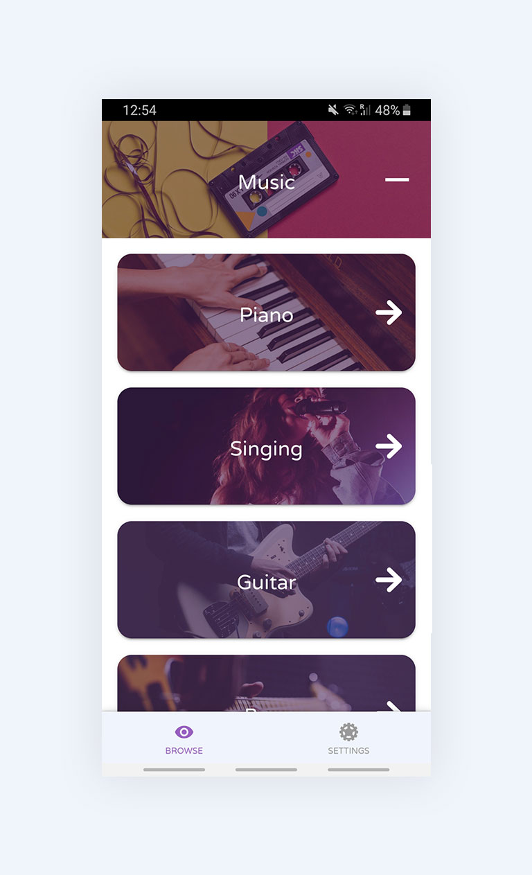
art ent is an app that artists can use to find people to give lessons to, and to manage those lessons. Students can find lessons, created by artists; view lessons and artist profiles, and contact them to book a lesson.
It was a side-projct between two friends, where I worked on the Design and Front-end, while Riccardo worked on the back-end.
Challenge
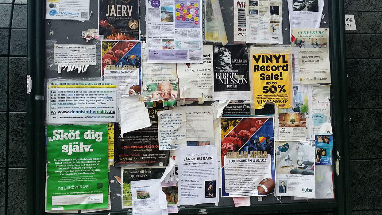
Artists have no tool to connect with people who want to learn their skills, and have to resort to local announcement boards, public announcement boards, and word of mouth. People wanting to learn rely on word of mouth and social media, with no consolidated go to source for artistic lessons.
Goals
-
- Create a tool for artists to find students.
-
- Allow for artists to create a basic profile.
-
- Keep it usable without an account for students.
The process
Discover
Before jumping into the redesign itself, we must breakdown the existing app and understand it in full.
Problem Statement
We originally heard from circus students that they struggled a lot with booking and managing private lessons they gave on the side to make money.
Talking to people
The approach to research for this project was relaxed and kept quite centered around the circus performers we knew, as well as immediate acquaintances.
When talking to the performers we learned:
- - Heavily reliant on word of mouth, social media.
- - Very unreliable work due to lack of control over spread of information.
- - Difficult to keep track of lessons and times.
Talking to students (i.e anybody that's not an artist), and we learnt that:
- - Most don't know where to look, resort to word of mouth of social media.
- - Very trust based, rely on word of mouth for trust.
- - Little follow up, motivation due to lack of awareness where to find lessons.
Market
Looking at the market, we found a lot of apps providing marketplaces for all sorts of services: utilities, technical lessons, lessons online, as well as a state sponsored children's cultural classes.
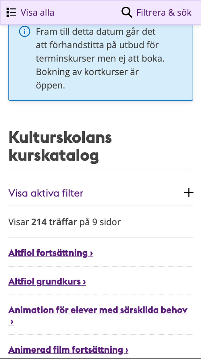
The Cultural Institute Classes are great, but unfortunately are restricted to children.
However, we found no tool built for people wanting to teach the arts to be discovered and to manage their lessons taking place in physical space.
Key take-aways
We came away from taking to people and researching with the following conclusions:
- - People don't have a go-to tool for finding, and providing, artistic lessons.
- - Artists specifically lack a tool to help them share their skill with others, loss of potential work.
- - All existing tools are spread out and not made for these particular needs, makes this process stressful and chaotic.
Define
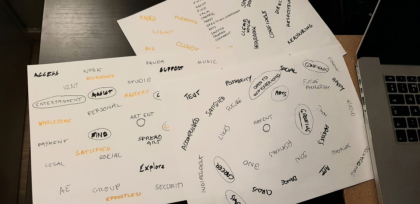
With some research done and the problem identified, we proceed to explore solutions, starting off with brainstorming ideas, feelings and experiences.
Ideation
The ideation process took place over a few sessions of getting together and brainstorming basically anything we felt an app for artists would have to cover and feel like.
Looking back, I should have taken the brainstorm sessions further with sketches and exercises. But this was enough to set us on a unified direction at least.
Flow diagrams
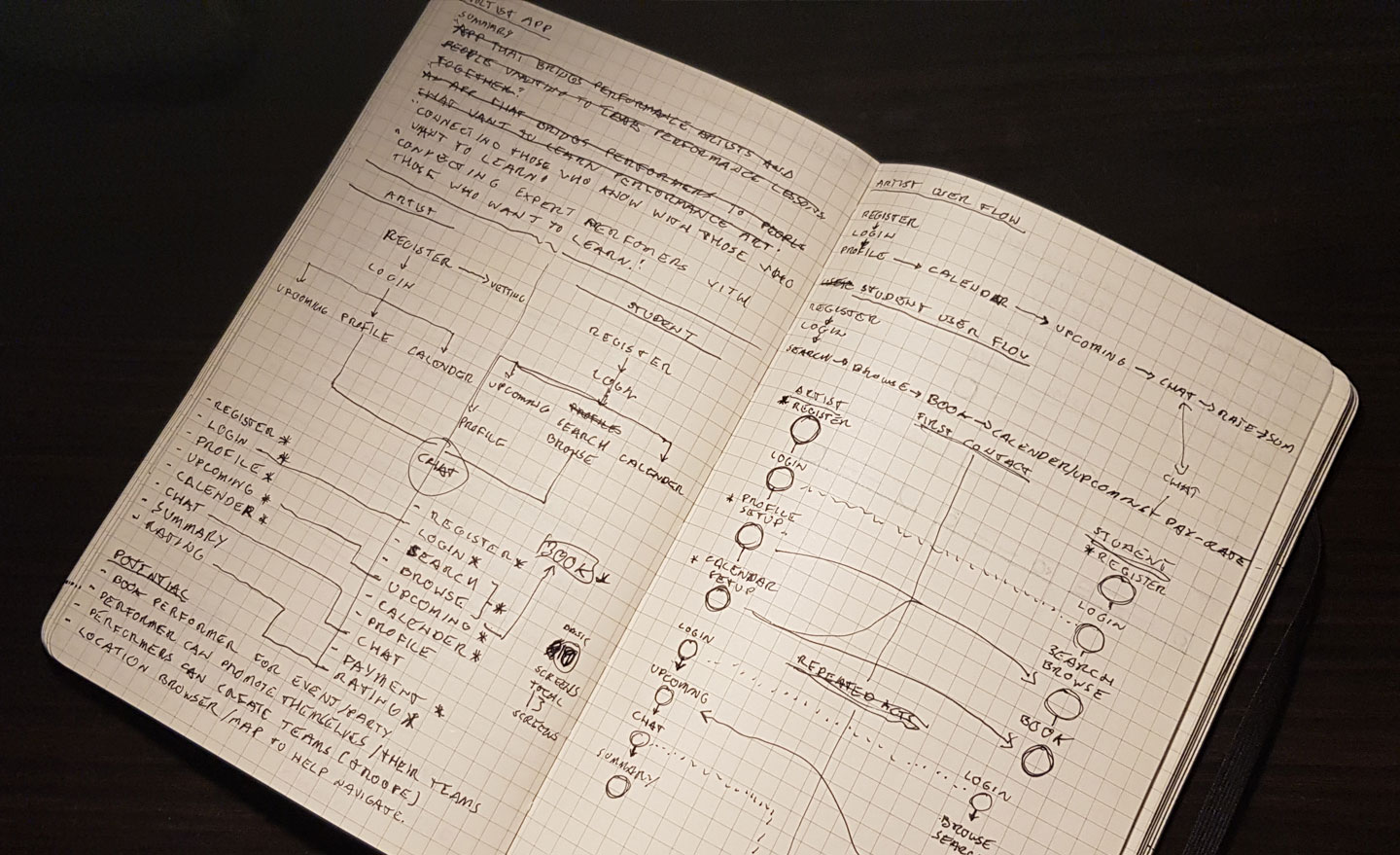
Once we had agreed upon some key principles for the app, we proceeded with exploring the flow both artists and students would take in order to achieve their goals.
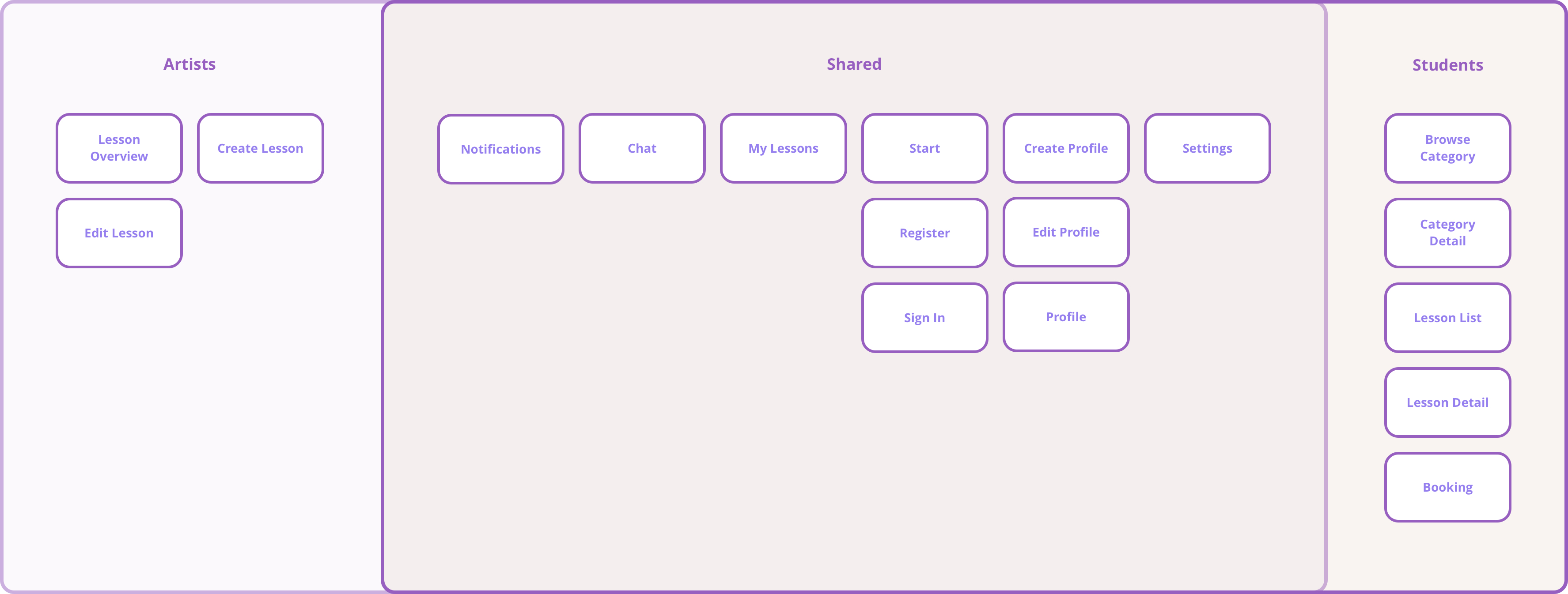
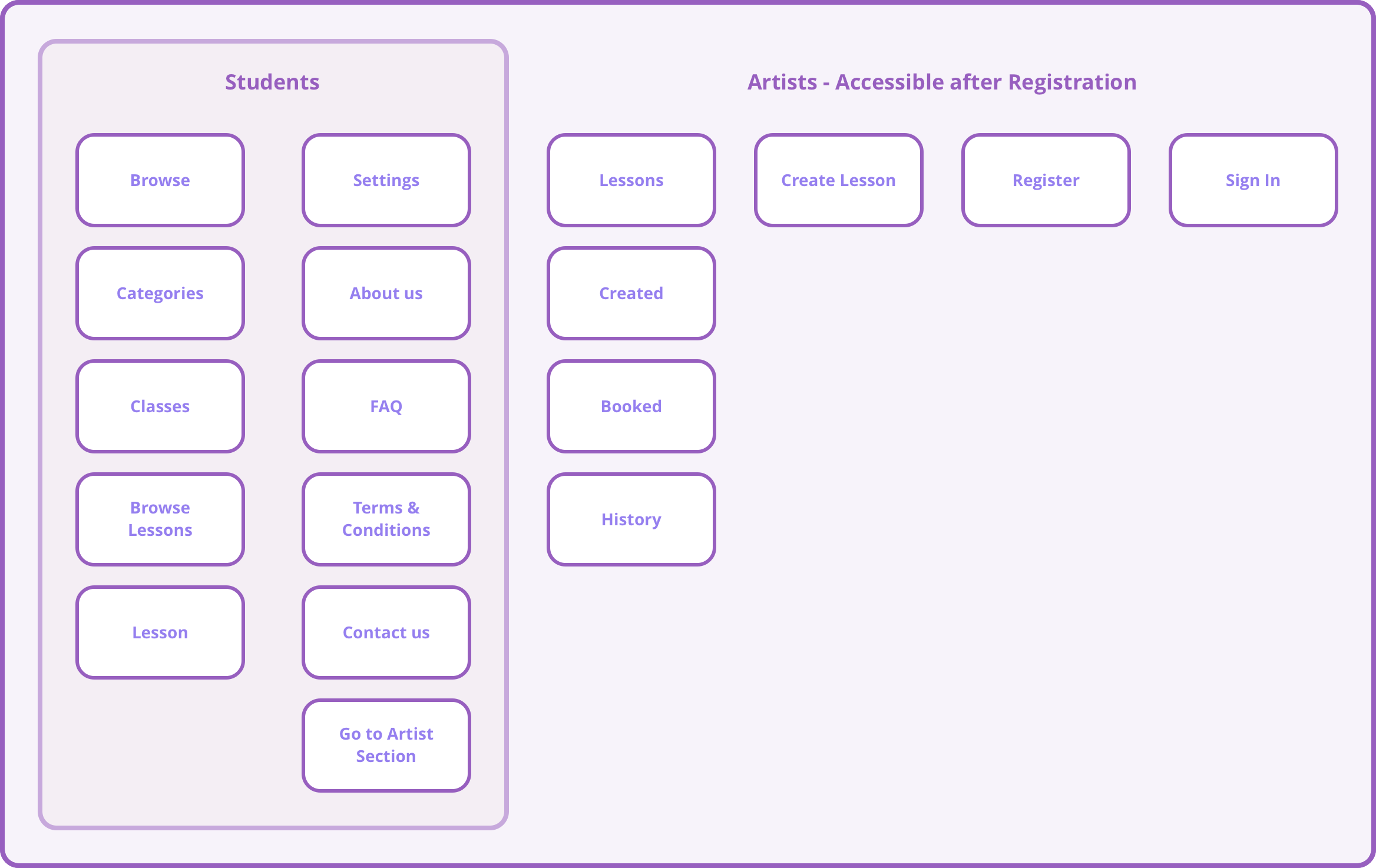
We kicked off with requiring sign-up for all users, and excluding Artists from browsing lessons. We also aimed to have Chat and Notification views.
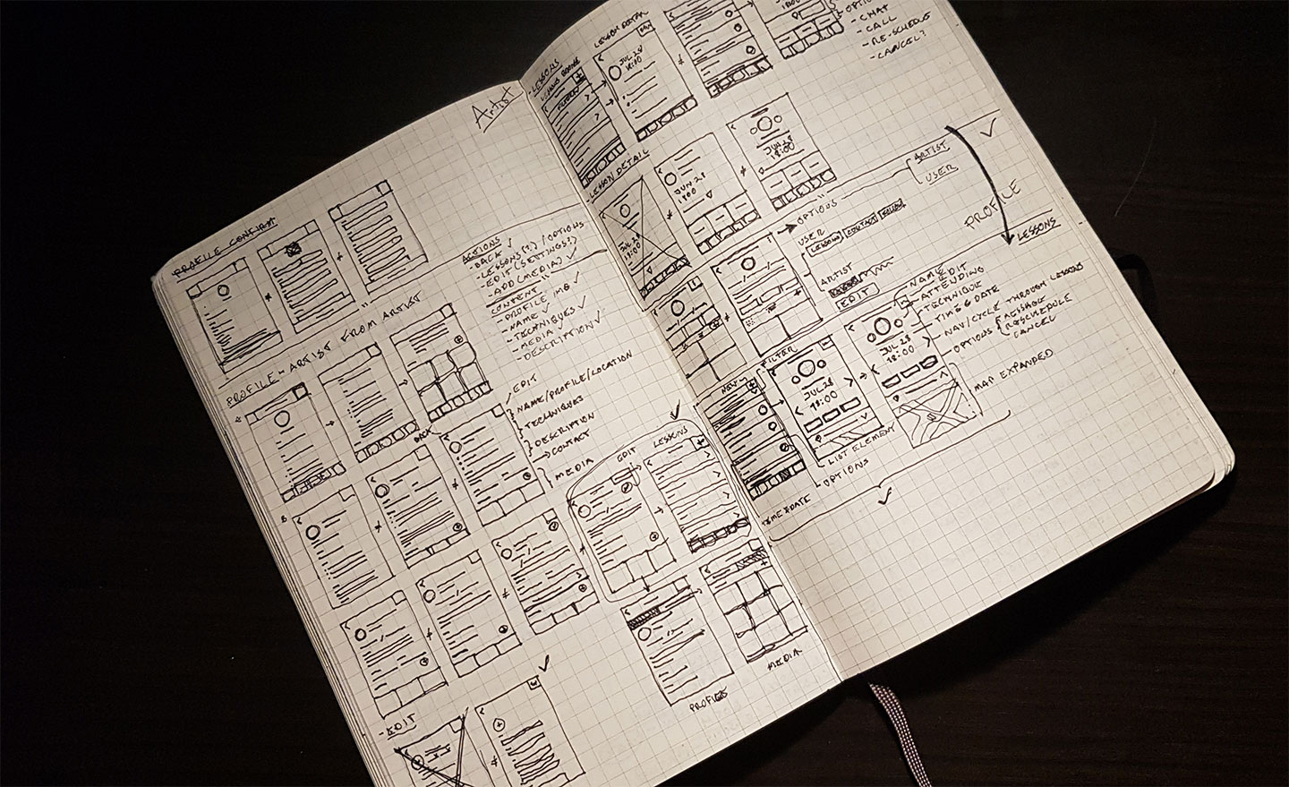
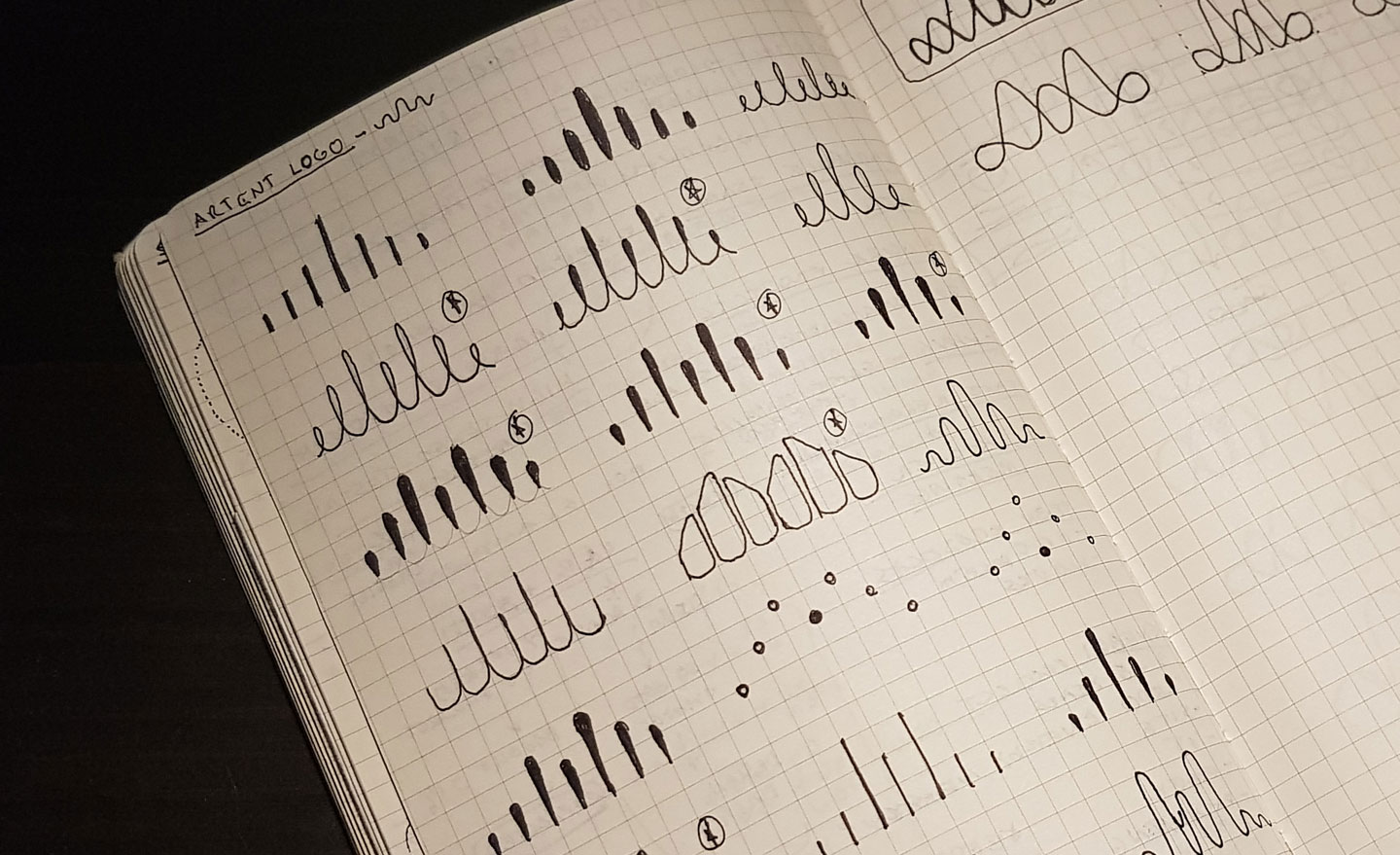
Sketches
With the new structure established, we begin sketching and ideating each view, with variations of UI elements, and structures. We then select the best candidates based on feedback and established patterns.
Branding & Visual Identity
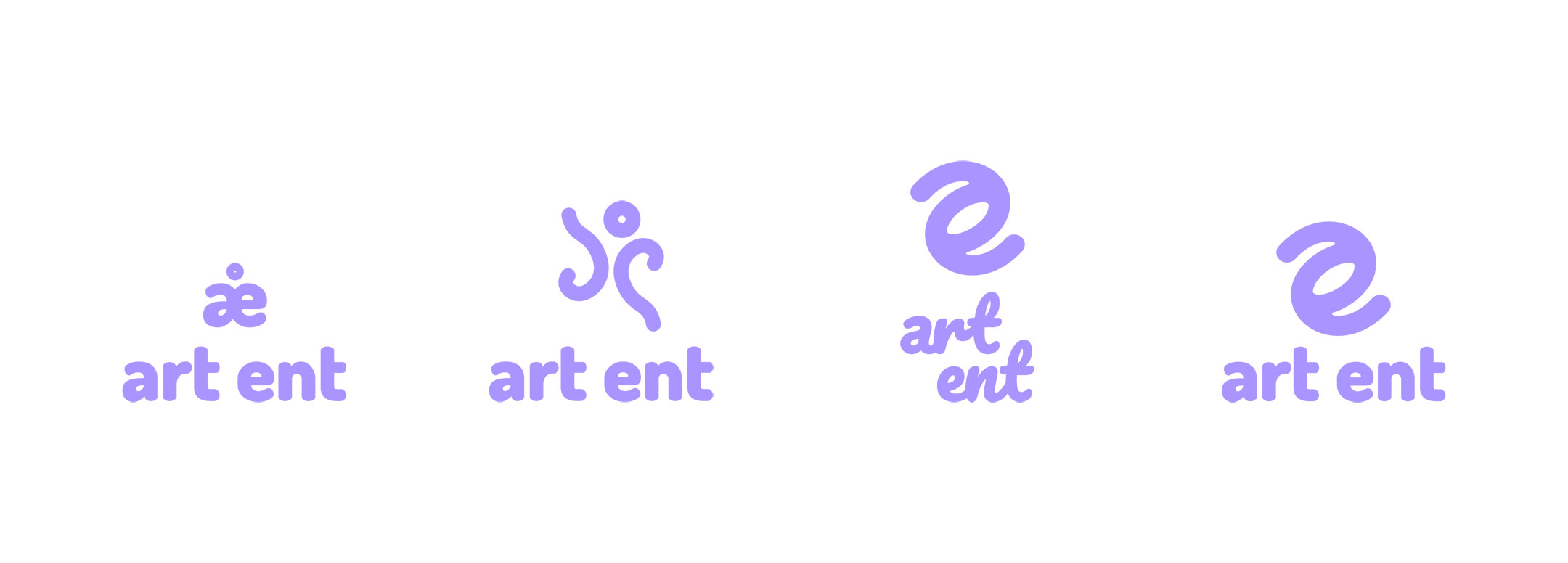
Although I will not be covering it in detail, we also worked on our own branding. It was kept minimal enough since it wasn't the focus of the project, however still done in such a way so that the app felt legitimate and had direction.
Brand Principles
As previously defined, we ensured the brand was bold yet simple, with no frills. Despite expectations, the artists we spoke to were not very tech focused, and were interested in getting lessons booked and tracked more easily.
We decided to focus on the following:
- - Welcoming
- - Simplicity
- - Easy of use
- - Lo-fi
- - Bold
Colours
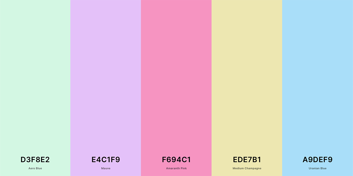
We decided to go with pastel purples and pastel blues to its association with creativity and calm. It also would differentiate us since purple isn't a very common app colour.
Courtesy of Coolors
We had to darken the purple however in order to ensure an adequate AA contrast with text for buttons and text.
Typeface
For the typography we decided to go with something free, accessible, and variable. For this, we decided on OpenSans, due to it's very spacious, airy feel.
The quick brown fox jumps over the lazy dog.
Iterate
Wireframes
Very early wireframes were created for some developers we collaborated with early on to create a quick app prototype using the Ionic App framework.
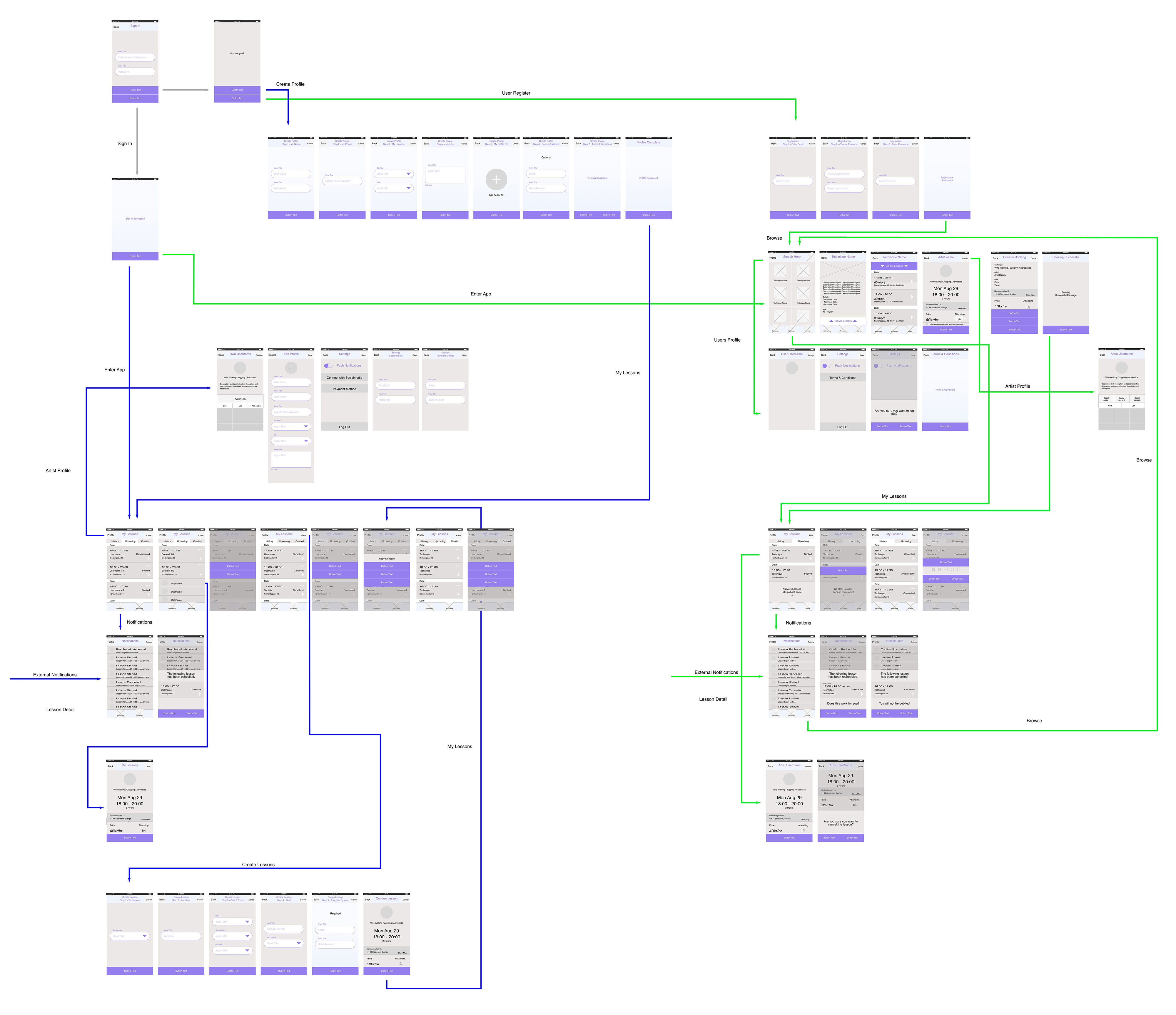
A wireflow was created as an early reference of the app. It's a bit big, but we felt the app was small enough to map out in its entirety. It has since changed a lot.
Mockups
At this point I was now building the front-end myself, so I used Mockups only as a jumping off point for discussions with my colleague to get some feel for the visual direction.
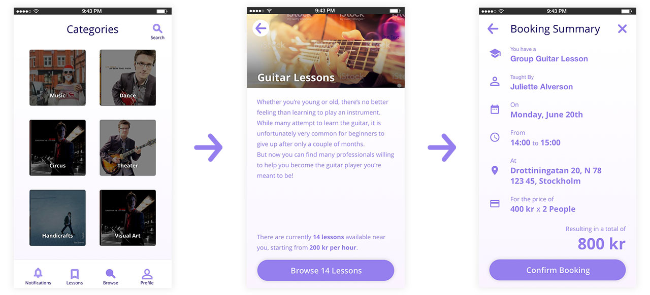
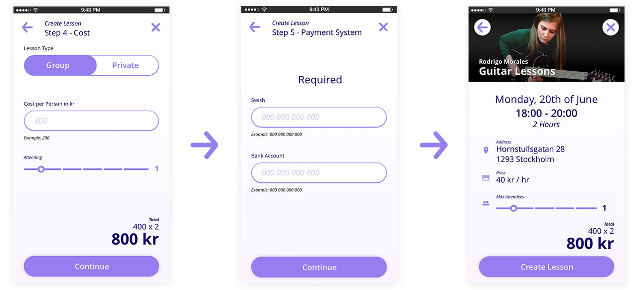
Most of the iterations continued on in code as we quickly iterated on ideas using CSS and Typescript. Here are some quick examples of the Mockups:
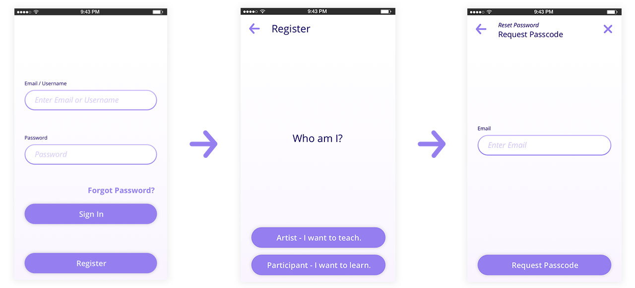
Onboarding was initially divided into two tracks, since we wanted to distinguish the process for students and artists to register.
Prototype
We also used the mockups to set up some quick prototypes to discuss around. This helps us visualize the early app layout and behavior before jumping into code. Once we got more comfortable with the structure, we left the Invision prototype behind and test only with the app.
View the prototype in Invision
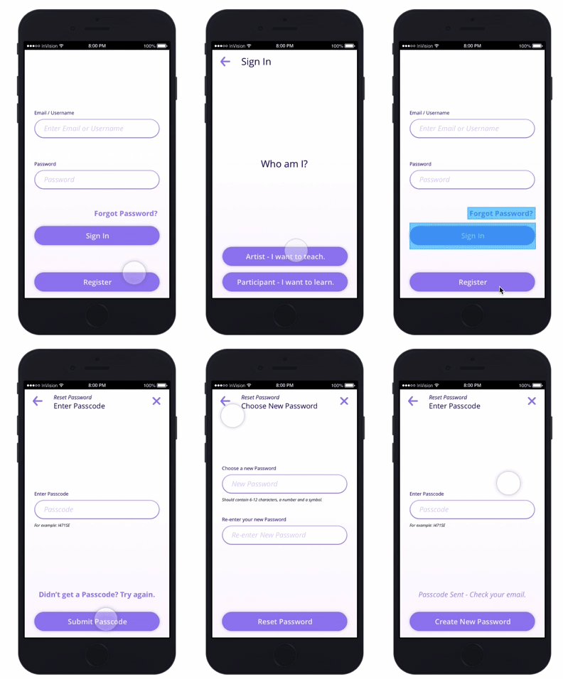
The prototype helped us get through most of the screen flows which got quite complex due to having two distinct user journeys.
Pivoting the App
When we got into development, we started off with an on-boarding process for all users, and aimed to include a payment system (e.g Stripe) and full booking handling for artists. However, we quickly noticed that this would take a lot more work, and slow down adoption.
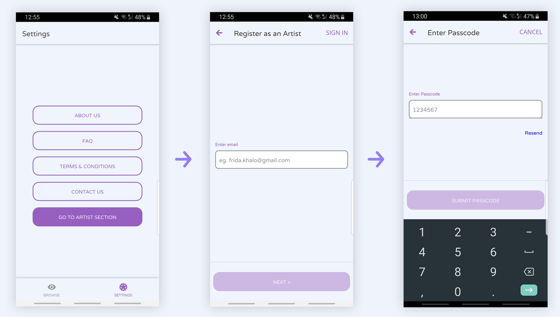
We quickly pivoted to simplify the app, removing any payment system, and focusing on connecting students and artists. We also removed on-boarding at the start of the app, and only required an account creation for users that wanted to give lessons.
Implement
Although this is the last chapter in this case study, we actually began with the development very early on in the process. We applied all the structural changes directly to code since we were so far in the development.
Development
One of the main goals of this project was to learn how to build a hybrid mobile app, so we kicked off with Ionic 2.0, which at the time was one of the two big Hybrid app frameworks, the other being React Native.
Having worked with Angular and Cordova before, Ionic was the natural choice for me. I didn't want to learn a brand-new framework on top of learning hybrid app development. However, looking back, perhaps React Native would have been the better choice.
Another important requirement was to follow the Vendor Design Principles as closely as possible. This meant using the ios- (Apple's iOS UIKit) and mb- (Androids Material Design UI Kit) rules of the frame work as much as possible.
The app
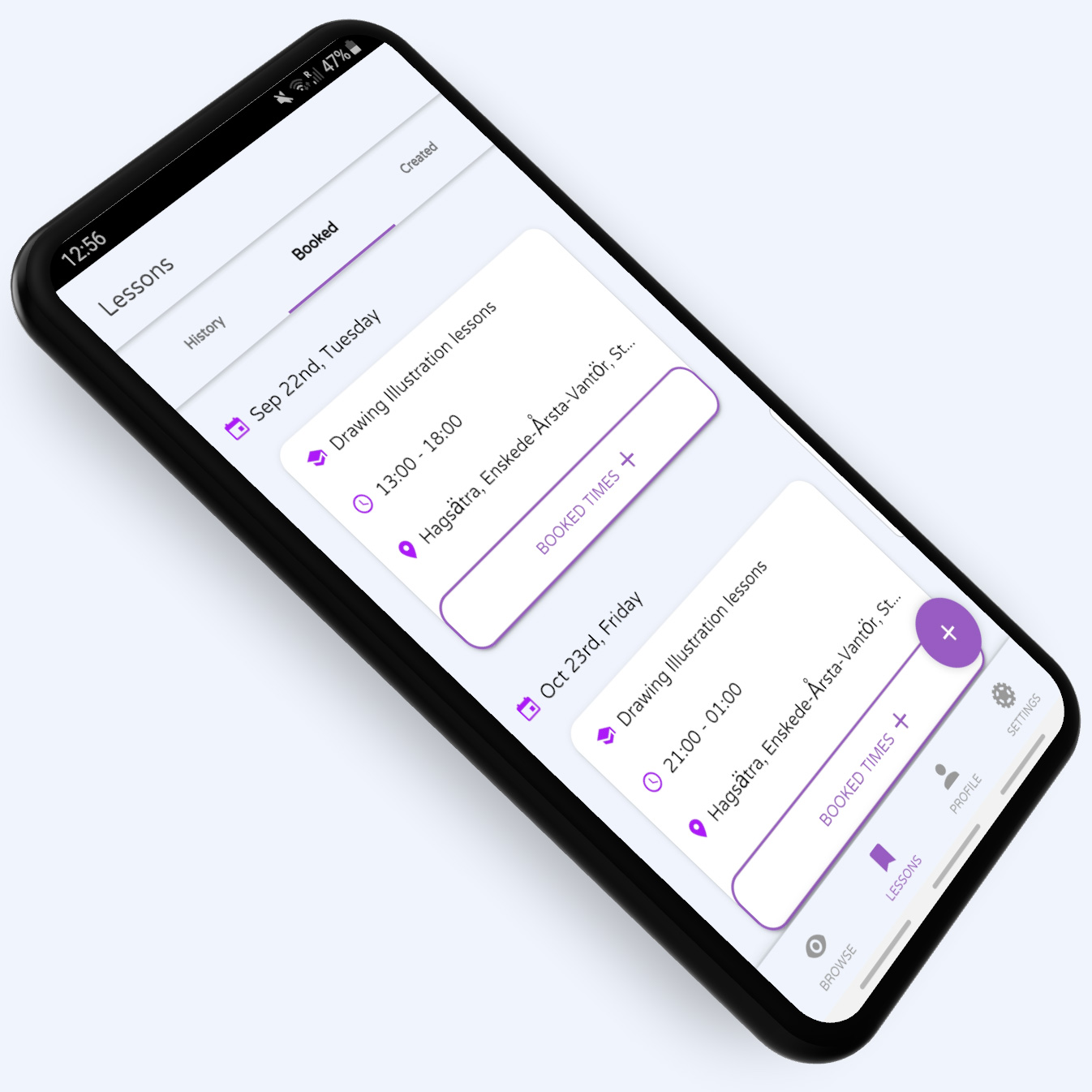
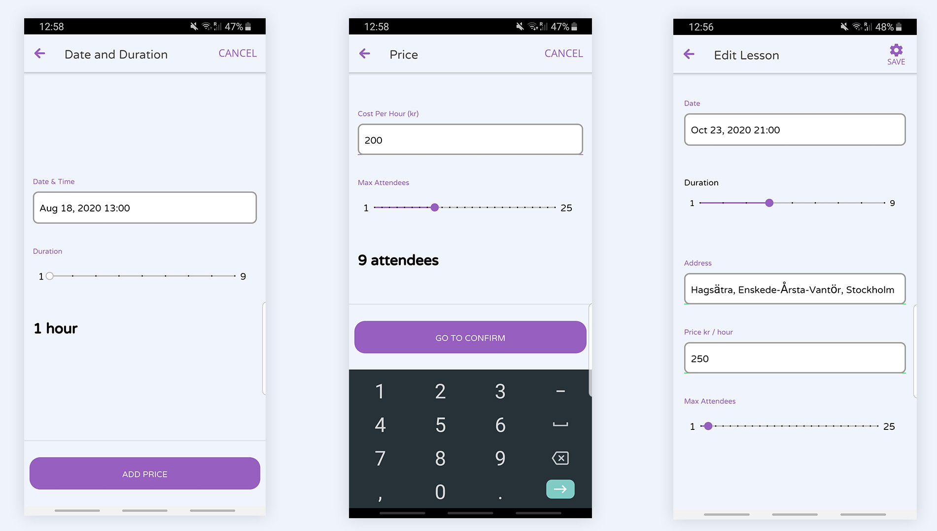
We settled on what we felt was an adequate prototype releasable as a Alpha on the Play Store (pending).
Although I wish it were more refined and has better visual presentation, we felt this was a good first version of the app to get it to be useful and to be testable.
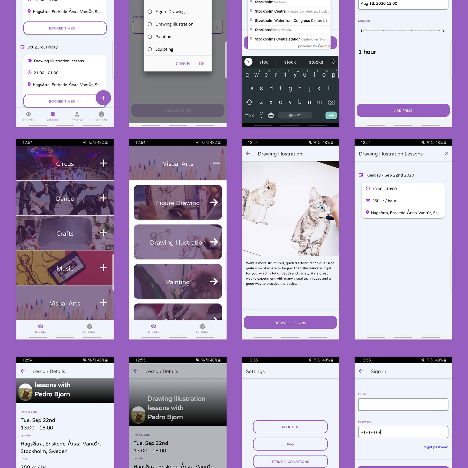
All the following screens were taken on an Android Phone.
Many the photos here were rendered using Rotato XYZ, a great mockup app.
Start screen
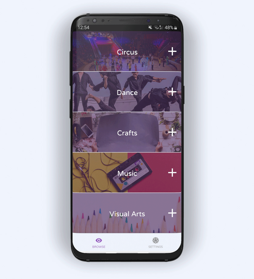
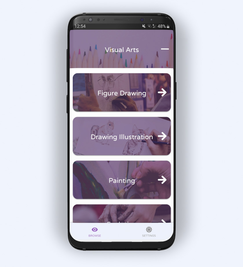
All users are presented with a collection of categories that each expand to reveal a list of sub-categories, or as we call them, Techniques.
Lesson Browsing
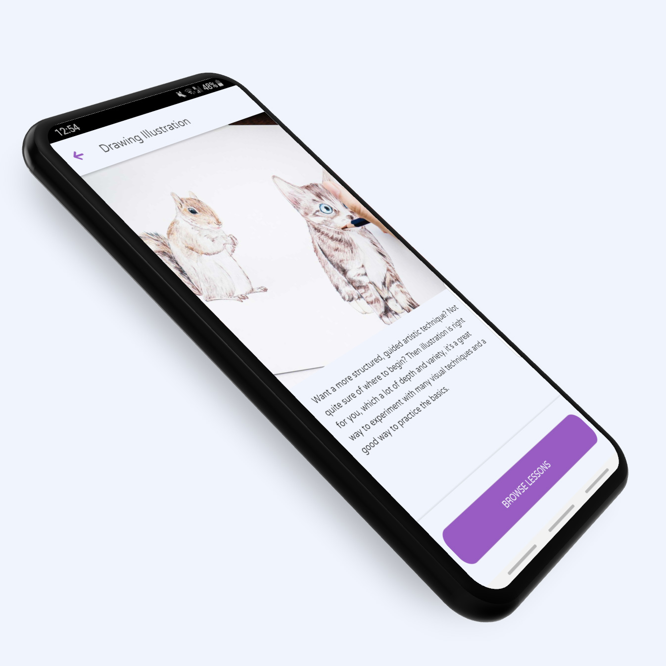
Here users can scroll through a list of date-sorted lessons. In this case, there's only one lesson available for Drawing Illustrations.
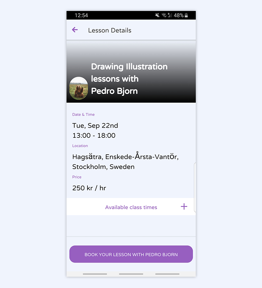
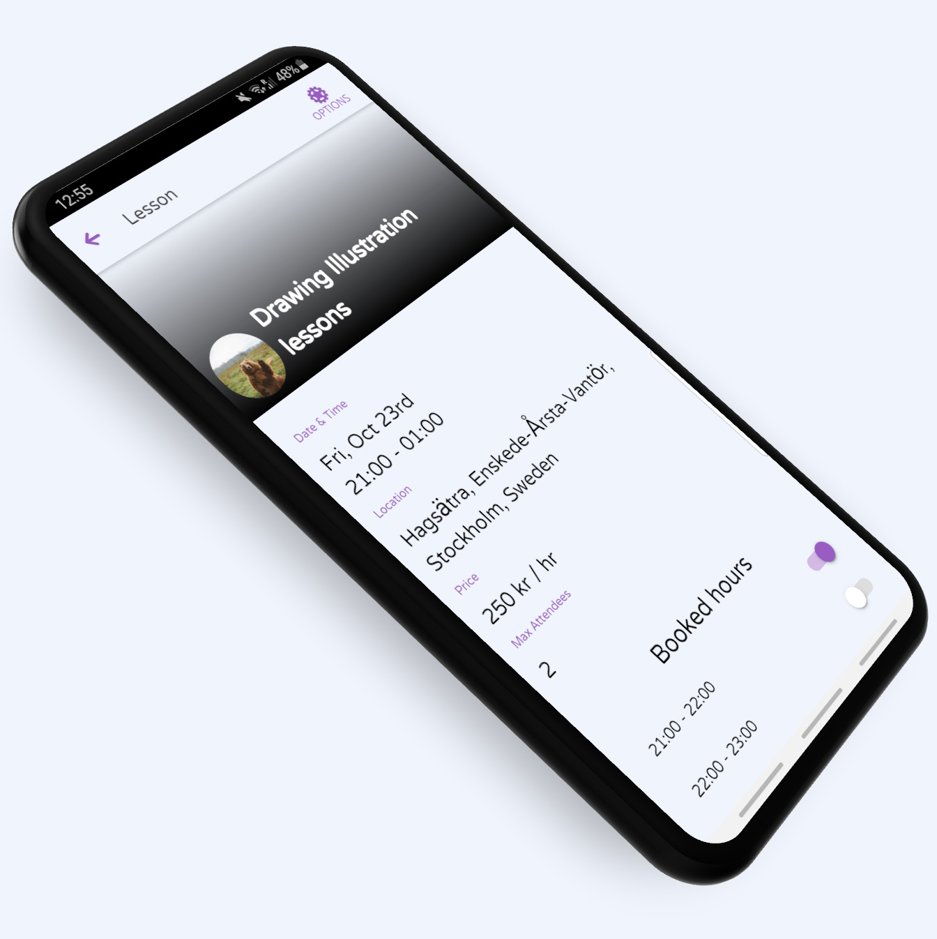
Lesson Details
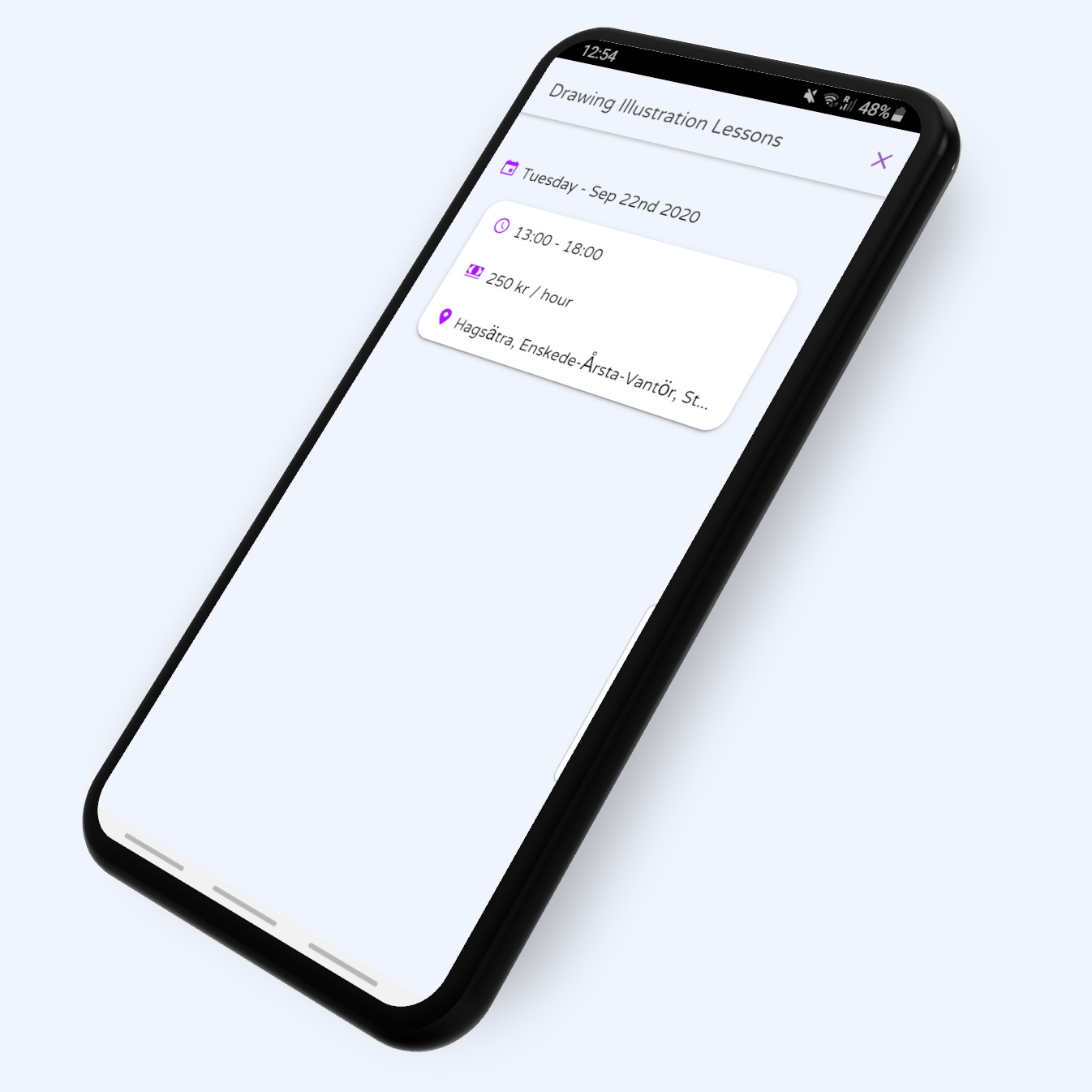
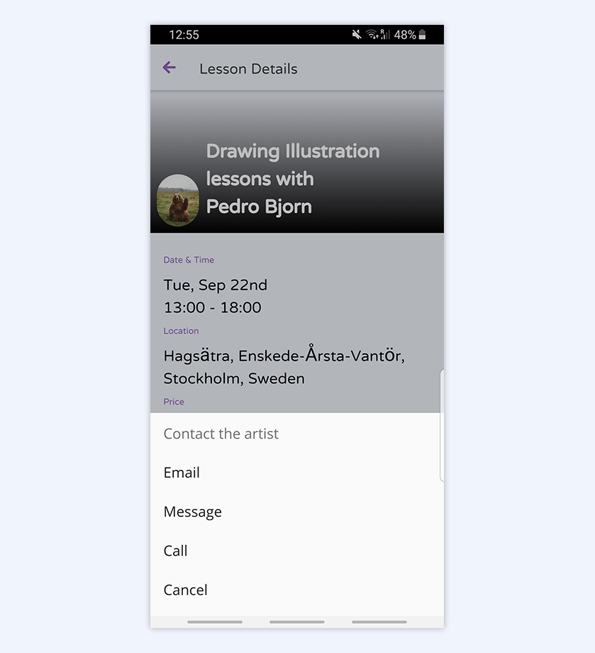
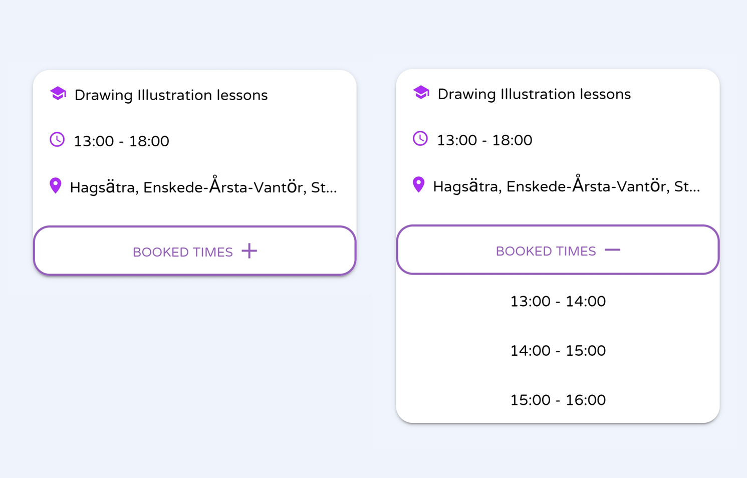
The user lesson details displays basic information for making a decision about booking a lesson, such as date & time, location and cost per hour, as well as available class times, which get toggled by the artist.
Tapping the lesson card leads users to a Lesson View, where they can inspect the lesson details, as well as find available booking times, and a button to contact the artist.
Lessons Learnt
When we set off on this project, we did so in order to learn more about mobile app development. These are the key lessons we learnt while doing so:
Prototype early
We were too excited to learn how to build the app to give prototyping and testing the adequate amount of time. This might have more to do with the nature of the project, but it would have helped us to find issues earlier on.
Keep it simple
Starting off trying to implement a Payment system was a big mistake. The best design is when nothing else can be removed, and we definitely benefited from editing here.
Don't try to do everything
We were doing this to learn new things, so that's fine, but if we would ever try to do this more seriously, we'd definitely have to bring on developers, researchers and marketers to ensure the app could be as good as possible.
Other Design considerations
- - Hiding / showing different Nav Bar options depending on student or artists wasn't optimal, goes against Apple UI Guidelines.
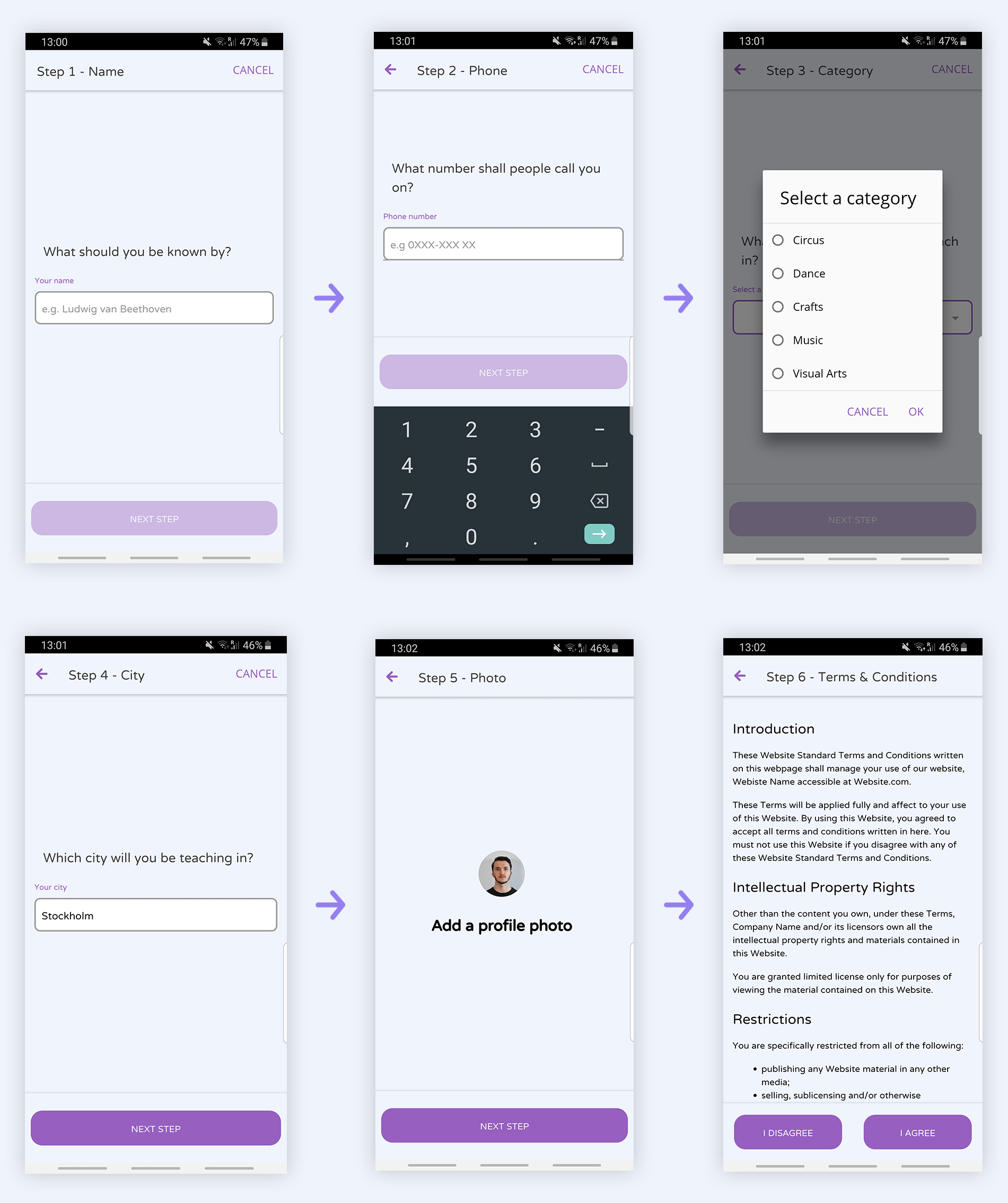
- - We should have added steps to the Registration and Lesson Creation wizards.
- - We should have allowed for registering with Social Media accounts.
- - We should have allowed for connecting with Instagram for the image gallery.
- - We should have made adding the phone number optional, allowed options for which way Artists could be contacted.
Conclusion
art ent was an endeavor that took more time and effort than we could have ever imagined, however, it was a rewarding experience and we learned a lot about mobile app development, and general product development.
We feel that for two people, starting with little to no Mobile App design and development experience, we came a long way, and if we were to start the app anew, we'd do a lot different.
Thank you for your time.
