Climate Clock
Redesign
Duration
October - November 2020
Responsibilities
Branding, Visual Design
Tools
Paper & Pen, Notion, Figma, Illustrator
Climate Clock burst into the scene in 2019 when they put up a huge clock in New York. Since then, it's become a movement synonymous with action against climate change.
I found this fascinating, and wanted to help somehow, so I decided lend a hand and propose an alternative to the visual representation.
Challenge
Being a product aimed at gaining attention and guidance, the challenge here was to revamp the site and app to create a bigger impact, as well as modernize it a bit.
Goals
-
- Refine the branding and visual identity.
-
- Focus on visual flair, causing an impact and gaining attention.
-
- Improve basic UX based on heuristics.

Overview
The goal was to pick an existing property and give it a a bold redesign. For this case, the Climate Clock was a perfect candidate, being a great cause and having a lot of potential.
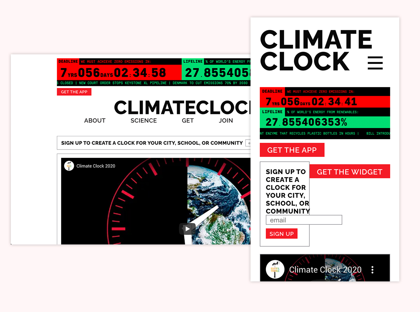
The original page is a great first step with a lot of potential. I borrowed a lot from here and simply took it a step further.
Due to the tight scope and focus on the Visual Design, this presentation covers the final outcome of the redesign. If you want to see more complete case studies instead, please check the art ent App project, or the Steam Mobile project.
Many the photos here were rendered using Rotato XYZ, a great mockup app.
Branding & Visual Identity
Logomark
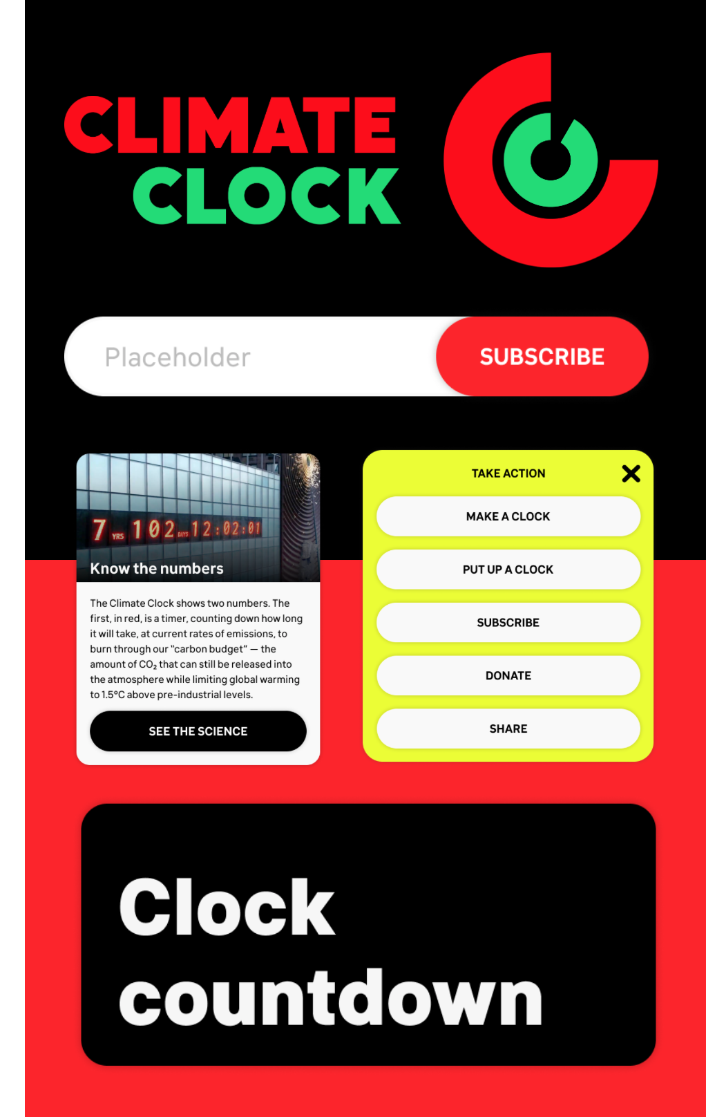
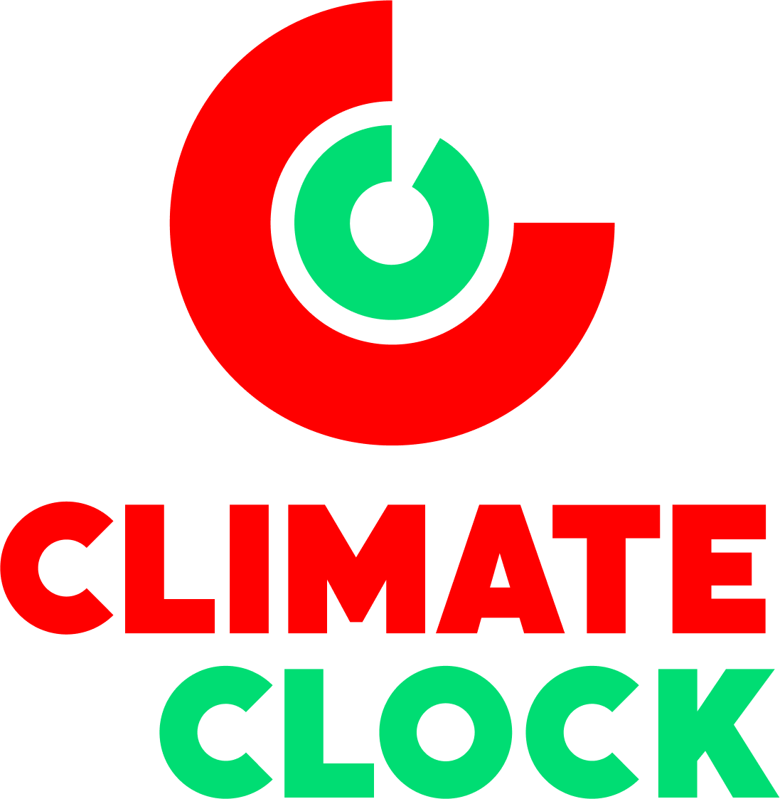
Designed to connect with the visual identity, the core was centered around the circular nature of a clock, earth, and the letter C. Inspired by an existing logo Climate Clock logo concept, the Sprint MOD Timer, and a logo by Stefan Kanchev for Kino Studio, the two circles represent two C’s.
The outside representing the Deadline, and the inside for the Lifeline, the two circles can vary in completeness, allowing for a dynamic presentation of the logomark.
Logotype
Made to work with the two brand colours: Red and Green, the logotype uses the Logomark “C”, while the “O” also based on the C shape. The text is aligned to the right to represent forward movement, while the ext and Logo mark colours correspond to each other. The inner logomark “circle” can have any angle, while the outer one should always be at 270 degrees.

The site
Main Page
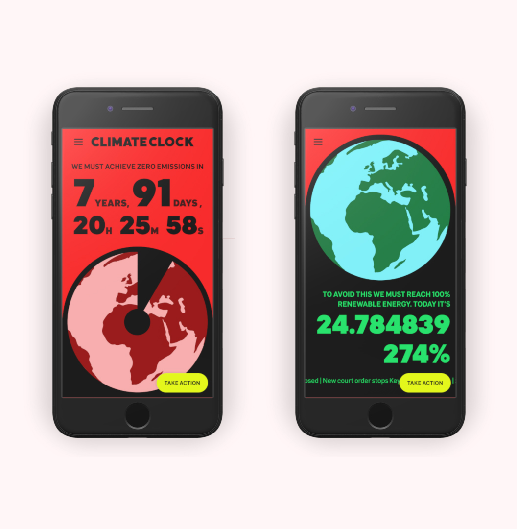
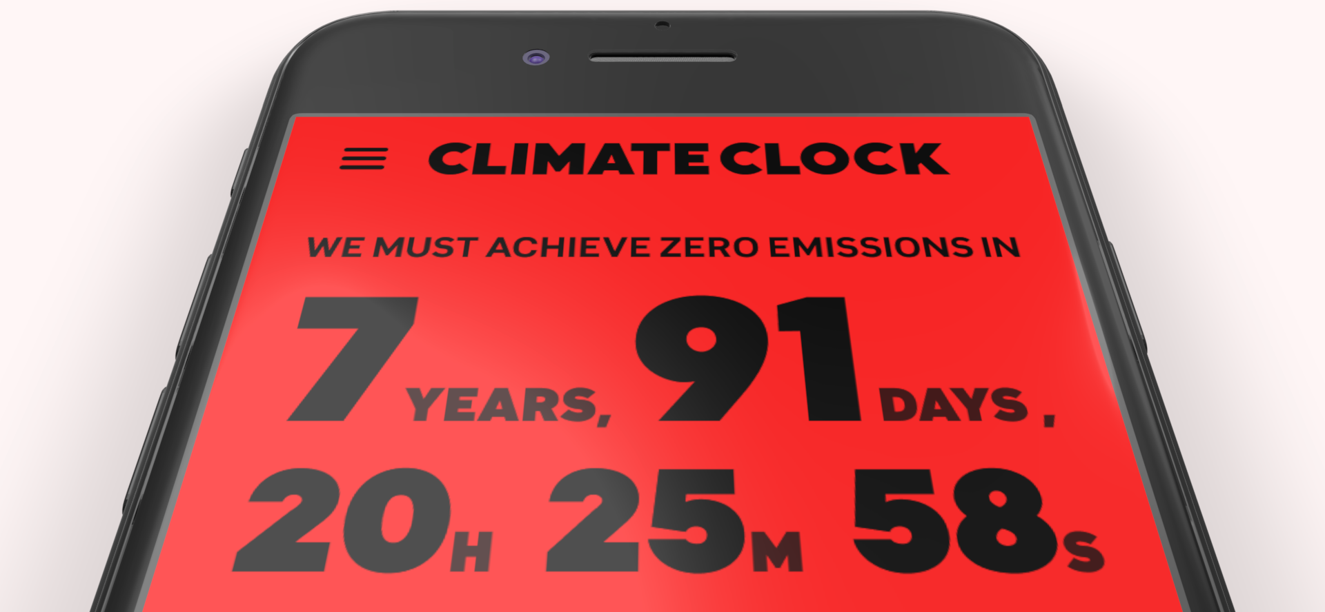
With the goal of creating a splash and getting attention, the landing page hero was updated to emphasize the core purpose of the Climate Clock: to make people aware that time us running out.
Mobile
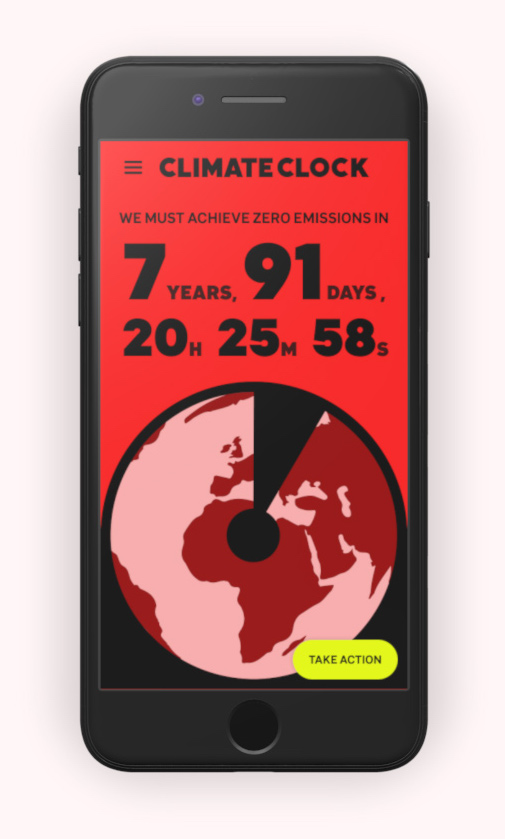
Starting with mobile, we make use of the vertical veiwport to include the counter, but also a visual representation of the climate clock, which transforms when scrolling down.
Desktop
Much like the mobile, the desktop also kicks-off with a large splash, adapted to a more horizontal layout.
This is followed by subscription bar and climate data section, ending with the About section.

The layout is based on a structure of Concern, Inform, Act, guiding the player from awareness to action as they scroll down.
Taking Action
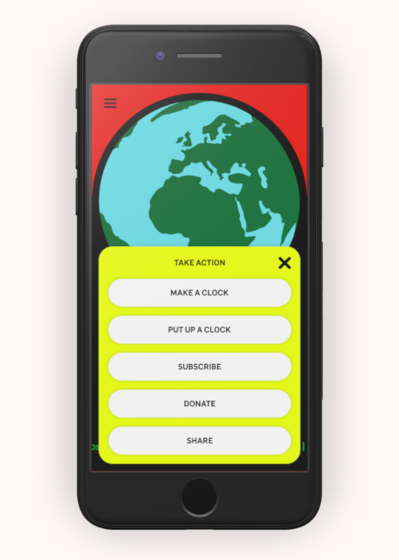
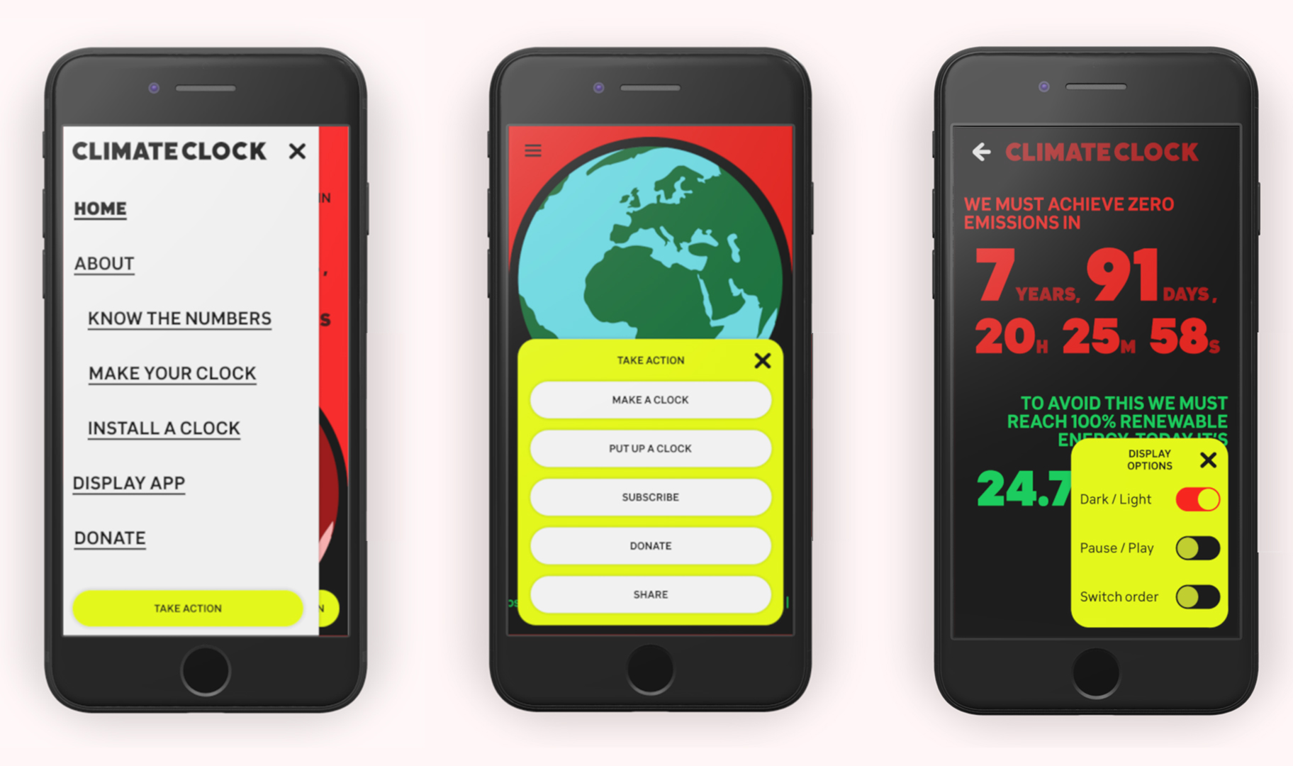
One key design decision was to prioritise taking action. This was solved by always providing a quick way to take action across the whole site.
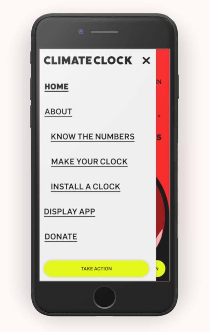
A Fast Action Button (FAB) follows the user as they scroll across the site. The Nav menu is also available on Mobile & Tablet to facilitate navigation.
Display / App
Another key design decision was to implement and address the "Climate Clock App". Turning it into a "Display" section, this works both as an App and a part of the site, both made to be presented, be it on projectors, or on a smart-watch.
Mobile
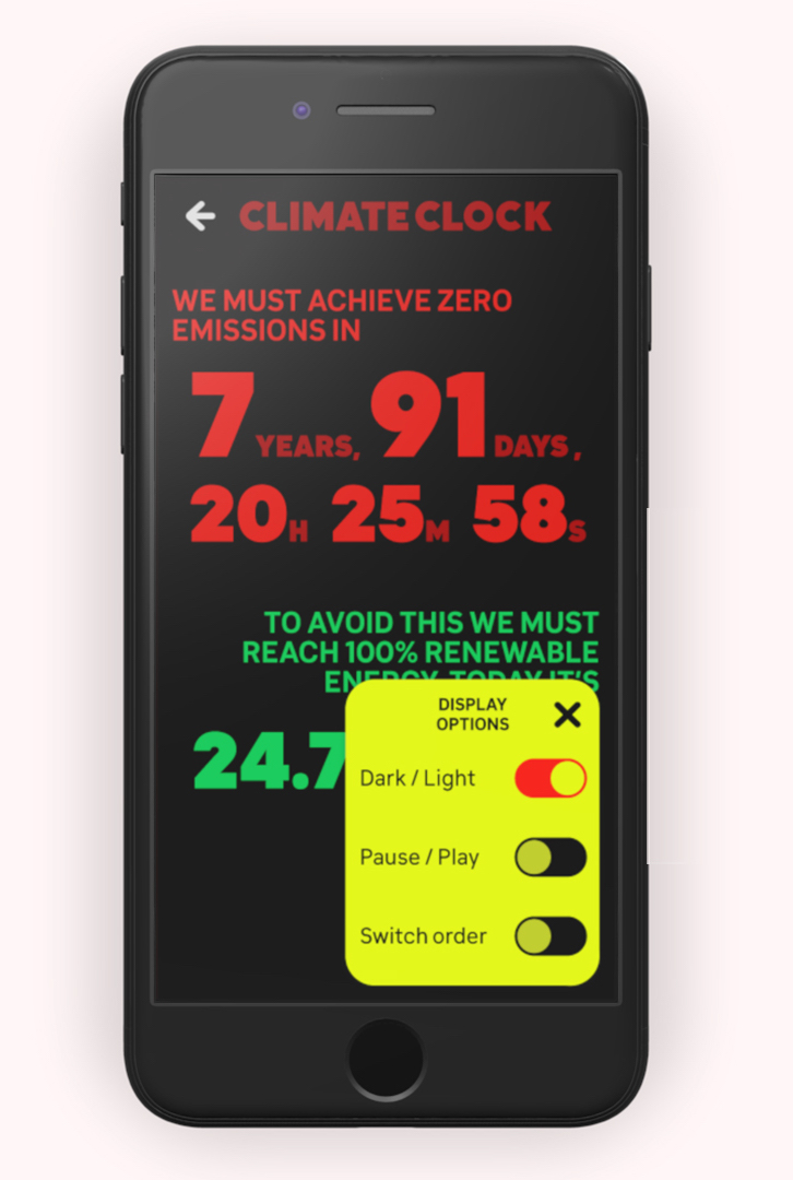
The Mobile Display / App does have a limited use. Due to this, an Action Fab should be added to the core view in the app. It can still serve as an interesting data display view, perhaps connectable to a projector.
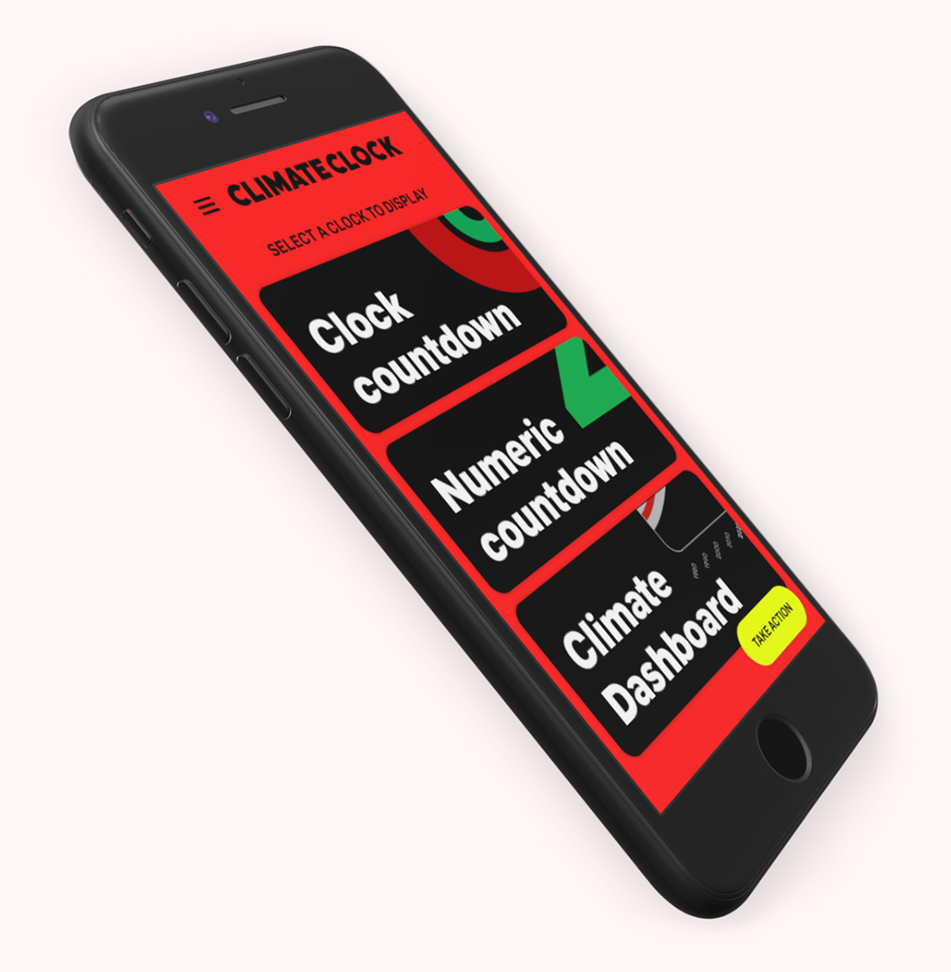
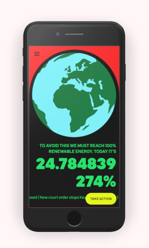
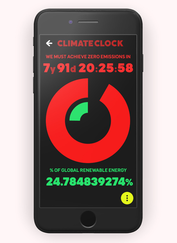
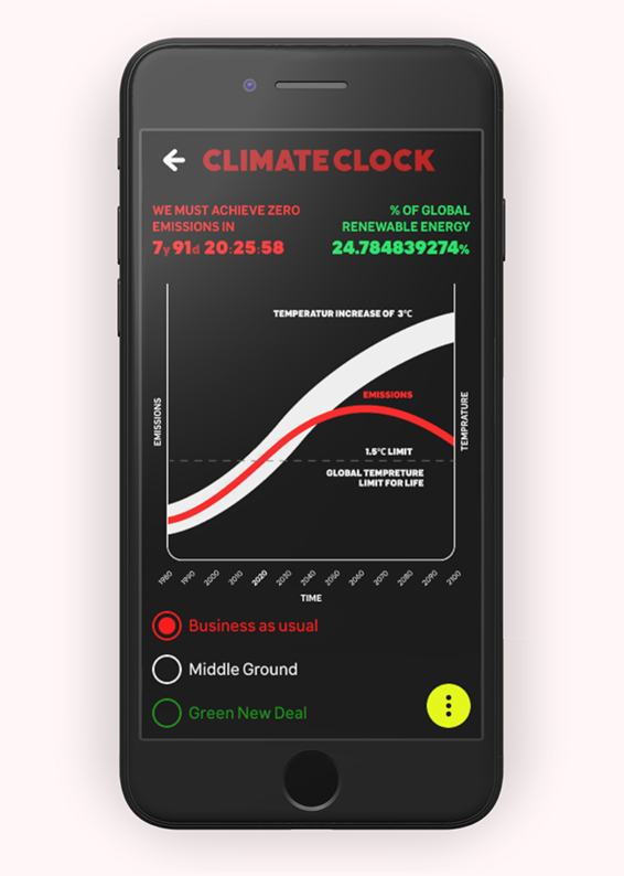
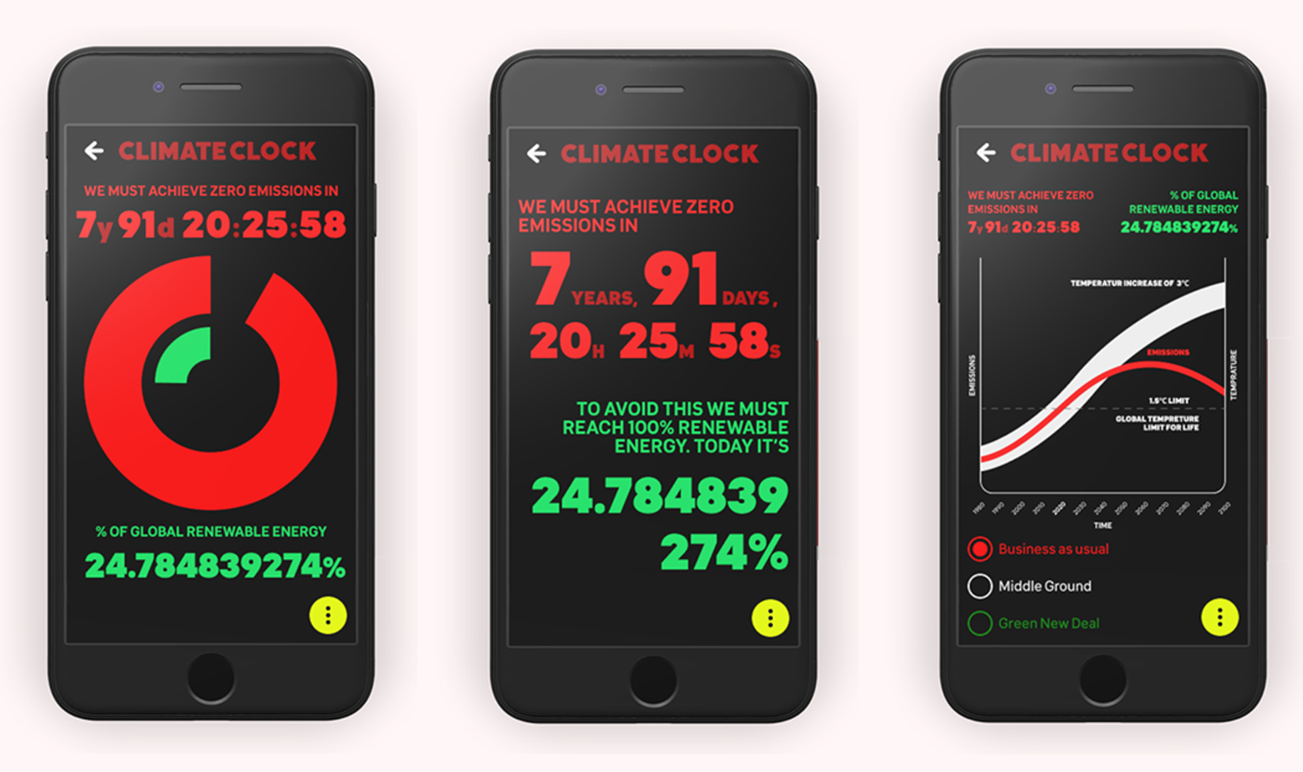
Three display types will show 3 different presentations of data: The Circular Graph, the Counters and the Dashboard.
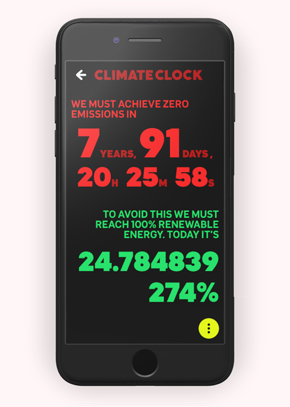
The Counter provides a balance between information and emphasis, with large numbers taking up most of the screen.
Desktop
The Desktop Display page is more likely to be used for projecting / display screens. Keeping the same designs, it makes better use of the greater screen realestate and horizontal room.
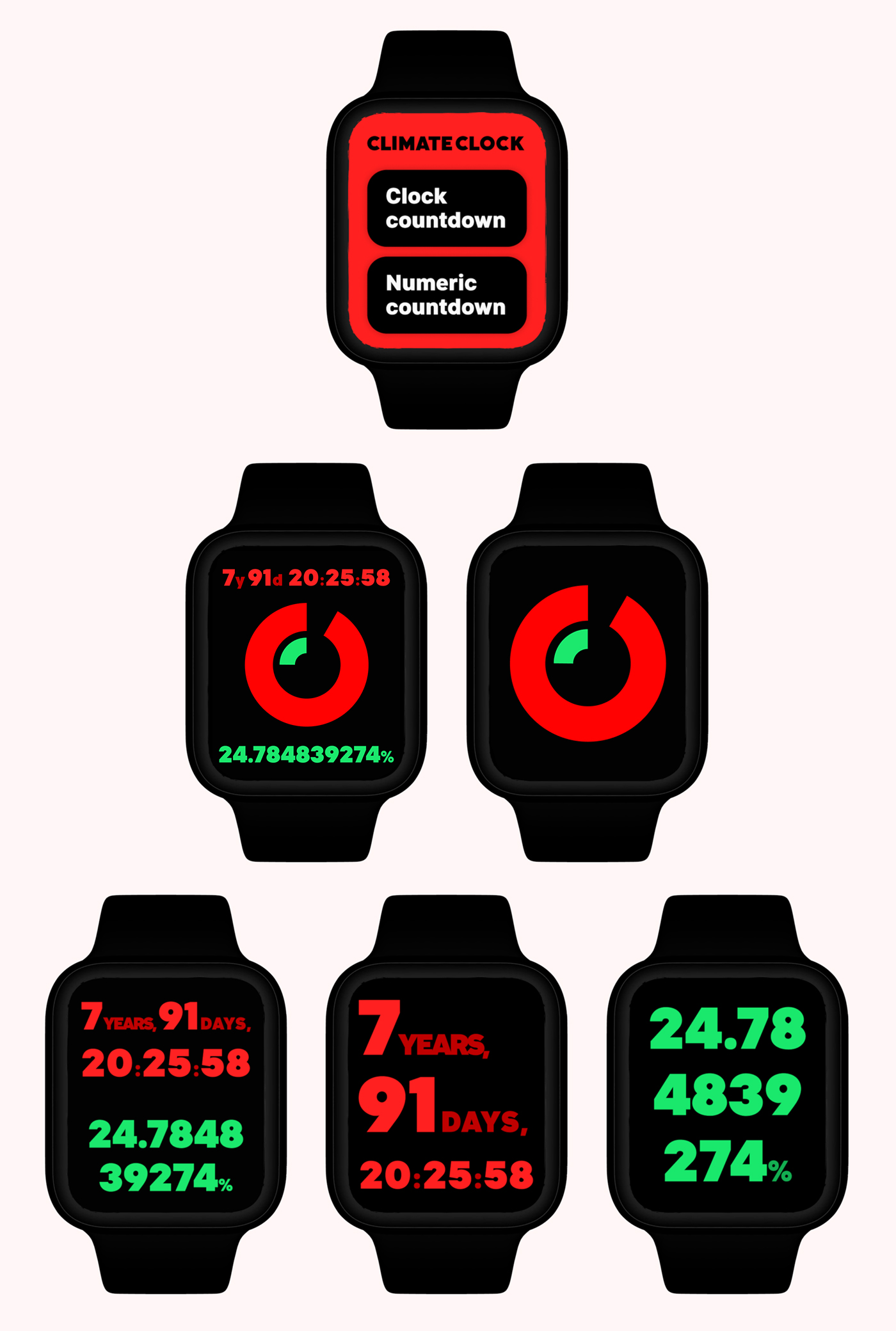
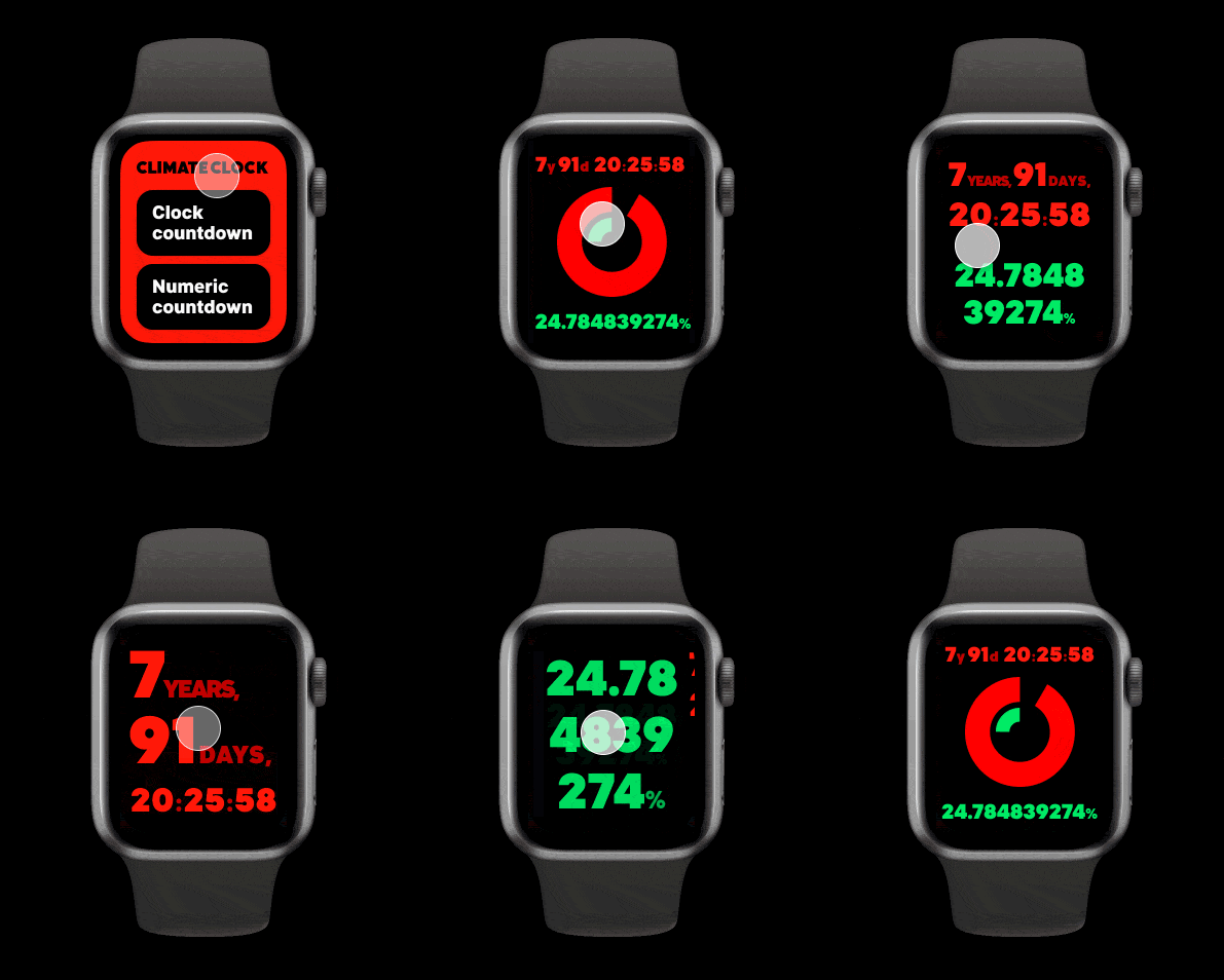
Smart Watch
Working with a project that included the word "clock", it was inevitable that there would be a smart watch app concept. Naturally this is a very limited app, due to it's very long-term time scale, it's still a good way to spread the word.
Science / Guide / About
Last but not least, we have the Information Pages. These all used the same layout template and elements, with a few variations or exceptions. The three pages are About, Make a Clock and The Science, which all provide valuable information about the Climate Clock movement.

Lessons Learnt
My goal with the project was to provide a redesign proposal for an existing property within 6 weeks, focusing on the visual design. These are the key lessons we learnt while doing so:
Talk to the stakeholders
Even though this was a small scoped visual design project, I still got in touch with the team, who graciously provided me with design assets I used for reference. This was invaluable and helped a long way to legitimise the work.
Always do an Audit
The focus may have been the visual design, however I still created a full UX, UI and Content Audit. The main purpose for this was to ensure I was fully understanding what I was redesigning, and not just focusing on the surface.
Do visual research & keep ideating
I struggled early on to find a good art direction and visual language. Ultimately it was about just keeping on coming up with new ideas, and not to give up. Visual research helped a lot as well in providing me with inspiration and confidence in which direction to take.
Conclusion
For this project, I wanted to emphasize on the visual design and art direction of a redesign. Less emphasis was given to the UX or Product perspective, since the focus of Climate Clock is to grab attnention and inform.
It was super gratifying and fun, and I learned a lot about prototyping, animation and visual design. I also shared everything with the Climate Clock team, and will be available to assist them if they with to use any of the work.
